
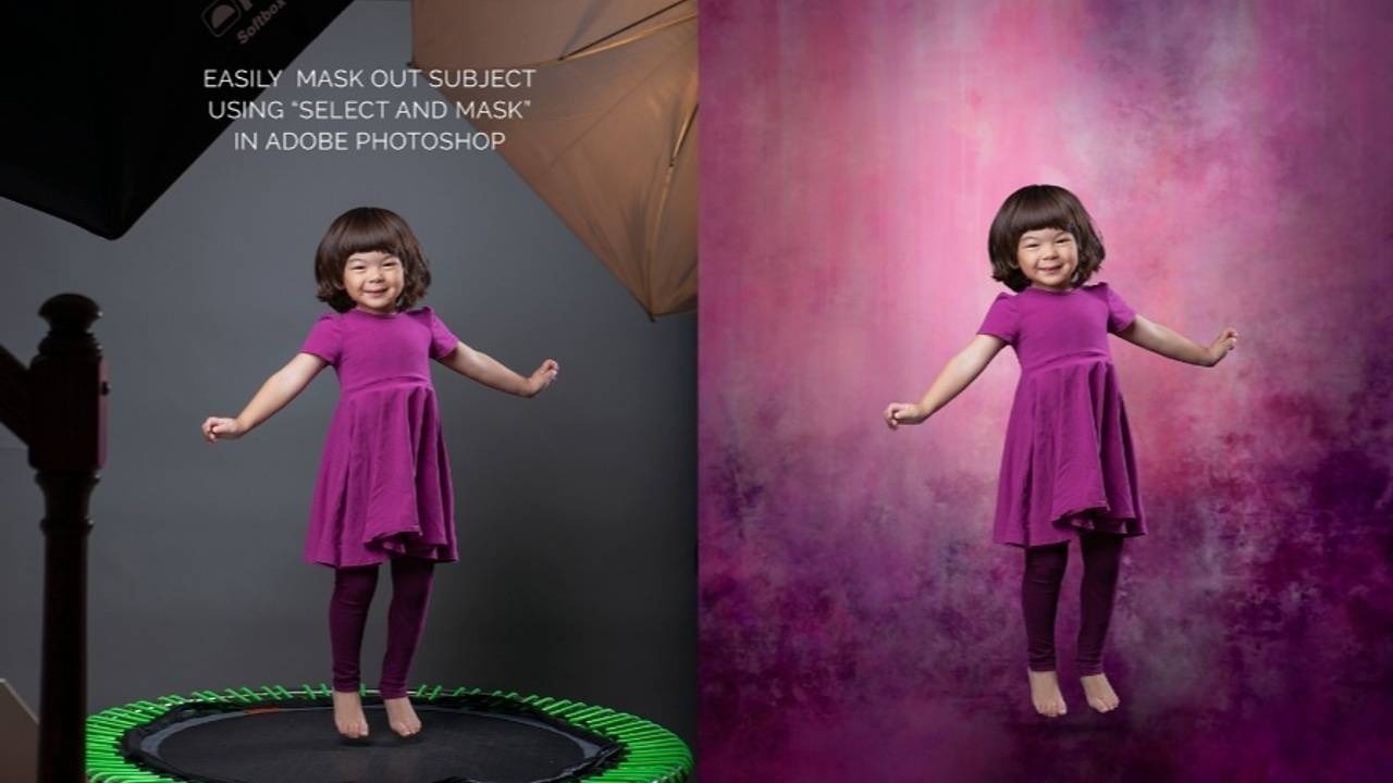
How to Creatively Use Textures as Clipping Masks

Textures have a world of uses whether you're editing or digitally painting. Did you know they could be used as CLIPPING MASKS? I'll show you how using Adobe Photoshop and (in my case) a Wacom Intuos Pro medium tablet. However, you don't even need a Wacom tablet for this edit! Adobe describes a clipping mask as a group of layers to which a mask can be applied. The caveat - it must be greyscale just like masking but in this case whatever is black will show your image. The black shape must be on a transparent layer, not a black and white solid layer. How do you do this with your greyscale textures such as the recently released Alla Primas 3 & 4 Collection? I'm glad you asked! Let's dive in!
In Adobe Photoshop open an Alla Prima texture document. Double click to unlock the layer. Double click on the grey part of the layer (not the name) to open the Layer Style dialogue. Move the "Current Layer" BLEND IF white sliders until all the white area has disappeared. To achieve this cleanly hold...
Background Editing - A Variety of Methods
In this post I will be referencing two softwares: Adobe Photoshop CC 2022 (mostly compatible with earlier versions of Photoshop), and Corel Painter 2021 (compatible with Corel Painter 2020 and newer in regards to the "texture" palette). The below portrait examples are photographic edits. They haven't been painted.
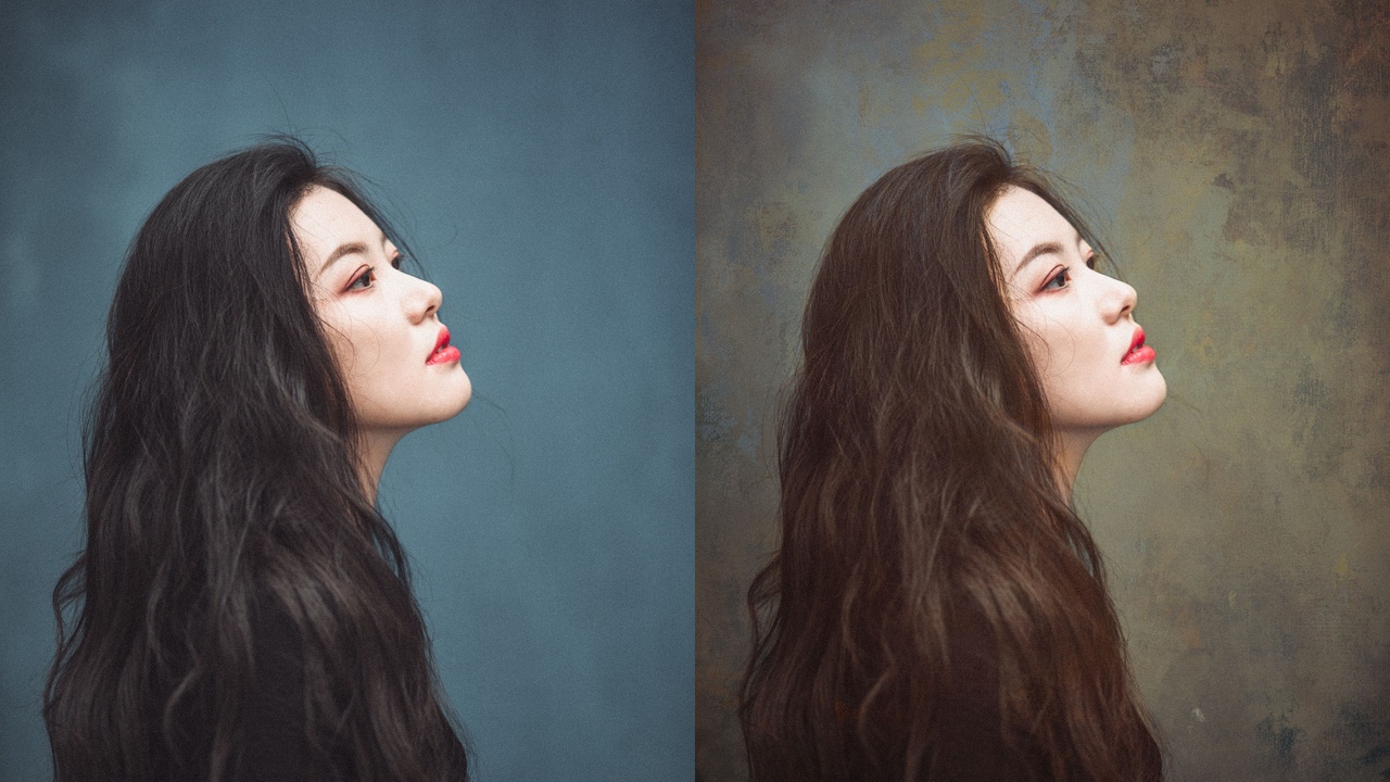
(Seen here with the Summer Gold 0505 set to Soft Light over the original file plus the original edit masked over top to bring back the face).
Backgrounds.
You've bought them. Now what?
Let me tell you. SO, SO, SO, SOOOOOOOOOOO many options. It's that age old answer, "depends..."
Depends on whether or not the subject was photographed indoors, outdoors, controlled light, natural light, clothing choice, how much texture do you want on the skin, how much texture do you want in the large spaces, etc. I could go on and on and on about this in an entire webinar.
Backgrounds are not simply limited to a drop in as a green screen replacement. Nope. That's the beauty of thes...
I bought a (digital) background. Now what?
I bet you love backgrounds as much as I do. You adore the brushwork, find the color harmonies pleasing, and think they'd be a perfect compliment to your portraits.
And you're absolutely right!
But with the amount of choices of backgrounds, there is that debilitating moment of oh crap. How do I USE the backgrounds?
I'd love to say there is NO WRONG ANSWER, but there sort of are. The foundations of art should be considered. Questions to ask yourself such as do these elements support my overall piece? Think more gestalt, and less detail when approaching background in relation to subject.
- Light direction (keep in mind this can be changed with some sometimes minor editing)
- Contrast (does it compete with my subject in shape and density, in saturation, in tone?)
- Storytelling (does it support or compete with my subject?)
- Texture (does it compete with my subject or is it somehow repeated in in brushwork or pattern in my piece?)
- Color harmony, value, and tone
- Shapes (do the overall ...