
Background Editing - A Variety of Methods
In this post I will be referencing two softwares: Adobe Photoshop CC 2022 (mostly compatible with earlier versions of Photoshop), and Corel Painter 2021 (compatible with Corel Painter 2020 and newer in regards to the "texture" palette). The below portrait examples are photographic edits. They haven't been painted.
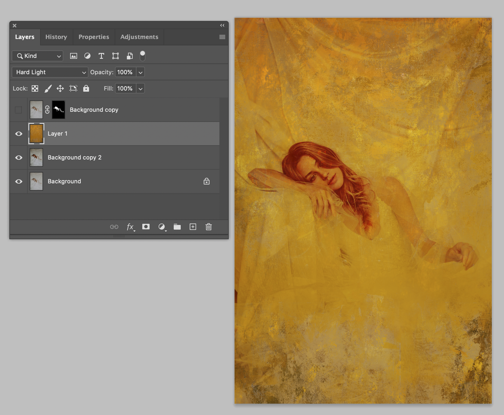
(Seen here with the Summer Gold 0505 set to Soft Light over the original file plus the original edit masked over top to bring back the face).
Backgrounds.
You've bought them. Now what?
Let me tell you. SO, SO, SO, SOOOOOOOOOOO many options. It's that age old answer, "depends..."
Depends on whether or not the subject was photographed indoors, outdoors, controlled light, natural light, clothing choice, how much texture do you want on the skin, how much texture do you want in the large spaces, etc. I could go on and on and on about this in an entire webinar.
Backgrounds are not simply limited to a drop in as a green screen replacement. Nope. That's the beauty of these lovelies! That's also the downside to them, as you can experiment down the rabbit hole and hours later have a dozen various outcomes. However, I've found a few consistent layer mode changes that produce usable outcomes that I keep in my back pocket as an artist.
Let me back up. In a former life, I was a ghost retoucher, and ghost painter for photographers (and once upon a time, a lab) all over the world. Now that Xia has come into my life, I mostly teach and create backgrounds. Long before that, I created and painted large scale backdrops on canvas, walls, and ceilings as murals and sets for photographers. Backgrounds have always been in my life in some form. I will admit it's much nicer on the shoulders to not be on 12 feet scaffolding painting a ceiling 8 hours a day as I've almost entirely gone digital. Almost. There are still some traditional paints that come out for background creation (hello, Alla Primas).
Rule number one about editing club. We don't talk abou----- kidding. You never touch your original layer. Seriously. Don't do it.
FULL REPLACEMENT METHOD
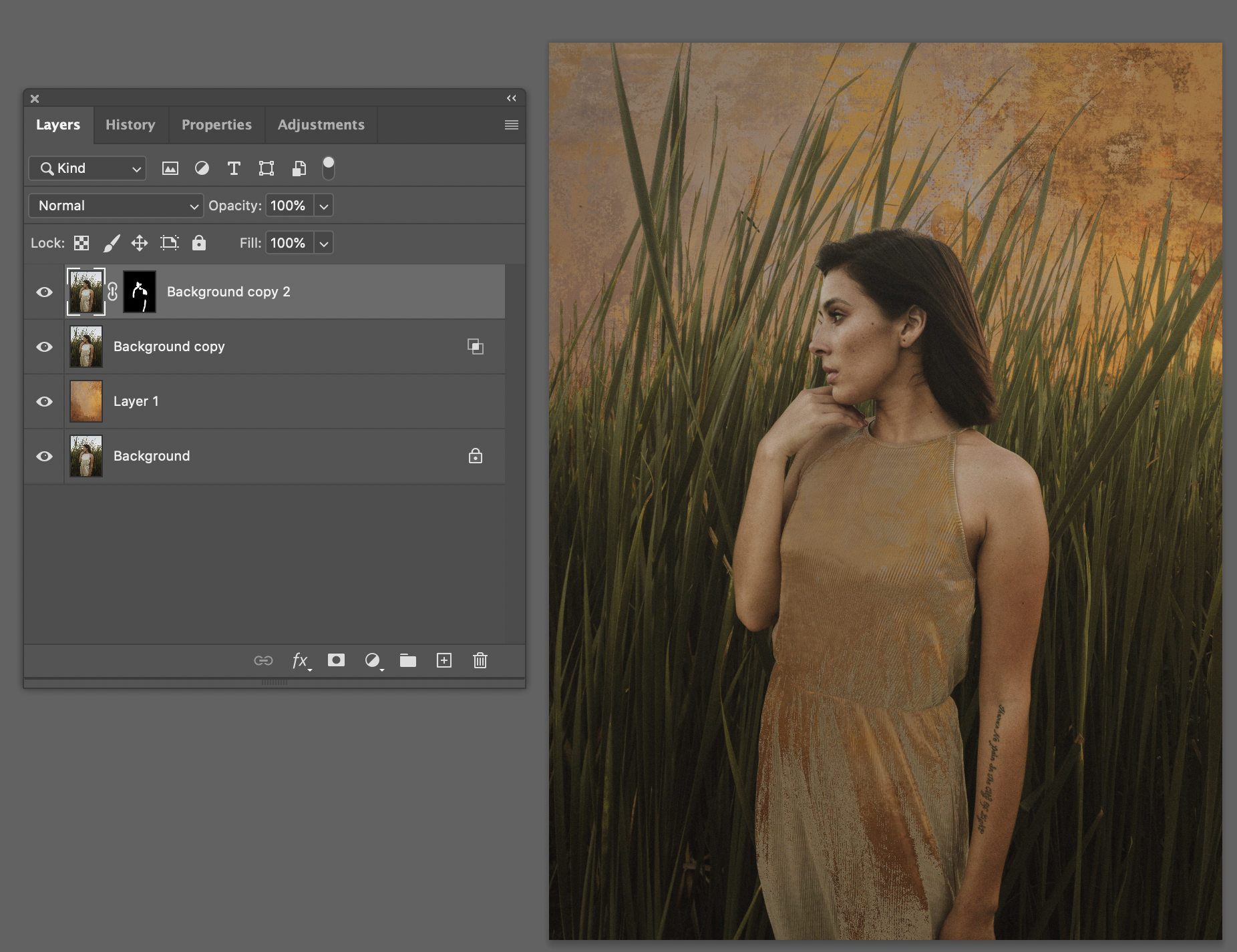
So let's start with the basic Adobe Photoshop CC 2022 background swap option. The "green screen" if you will. The full background swap. There are several ways to achieve this. The easiest being if you have a controlled lighting setup, with a solid background behind the subject such as a grey, green or blue solid paper background that's somewhat evenly lit or a strong separation between subject and background space (break out those hair lights). This helps Photoshop pick out the subject accurately. Always leave your base layer alone. Make a duplicate layer (cmd or ctrl + J). Use the "Quick Selection Tool" and then along the top find "Select Subject." This will give you a fairly accurate selection of your subject. Click on layer mask in your layers palette. If you need to refine the layer mask you can do so with a basic brush. Remember, black hides. White reveals in the layer mask. This is most of my editing in Adobe Photoshop CC 2022 when working with layers. Simple layer masking.

Once you have your subject masked, you can sneak in a new background by selecting the background of your choice, and layering it beneath your subject's layer. Voila! To make it believable you can make another copy of that background layer and dodge/burn areas where your subject's light would naturally fall off/on the background. If you need more bokeh simply add your favorite blur onto the background's layer copy. THEN add some noise to match your subject IF there is photographic grain. This makes everything look like it was originally captured in your camera. You can further bring it all together (everyone together now, "gestalt!") by tweaking the color harmony or values to strengthen the background to subject relationship with adjustment layers in Adobe Photoshop CC 2022. Now, you can do this with older versions, too, but the masking option of Quick Selection Tool might not be available. Save your layers. Once you're happy, flatten, make sure it's the correct color profile for the printer, and boomsies.
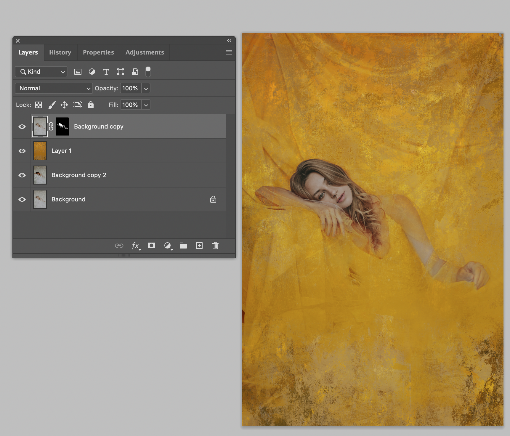
A quick tip in the image above. Add a 50% grey layer above your subject and "clip it" to the subject layer. then paint with a soft brush some gold colors along the hair line so it looks like gold is reflecting along the hair line. I'll often do this with light colored clothing, and hair lines.
OVERLAY METHOD
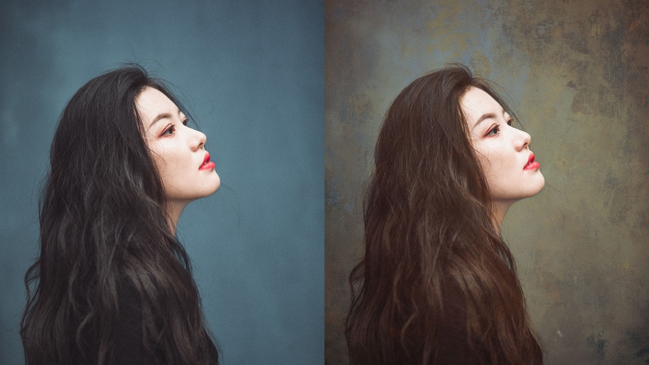
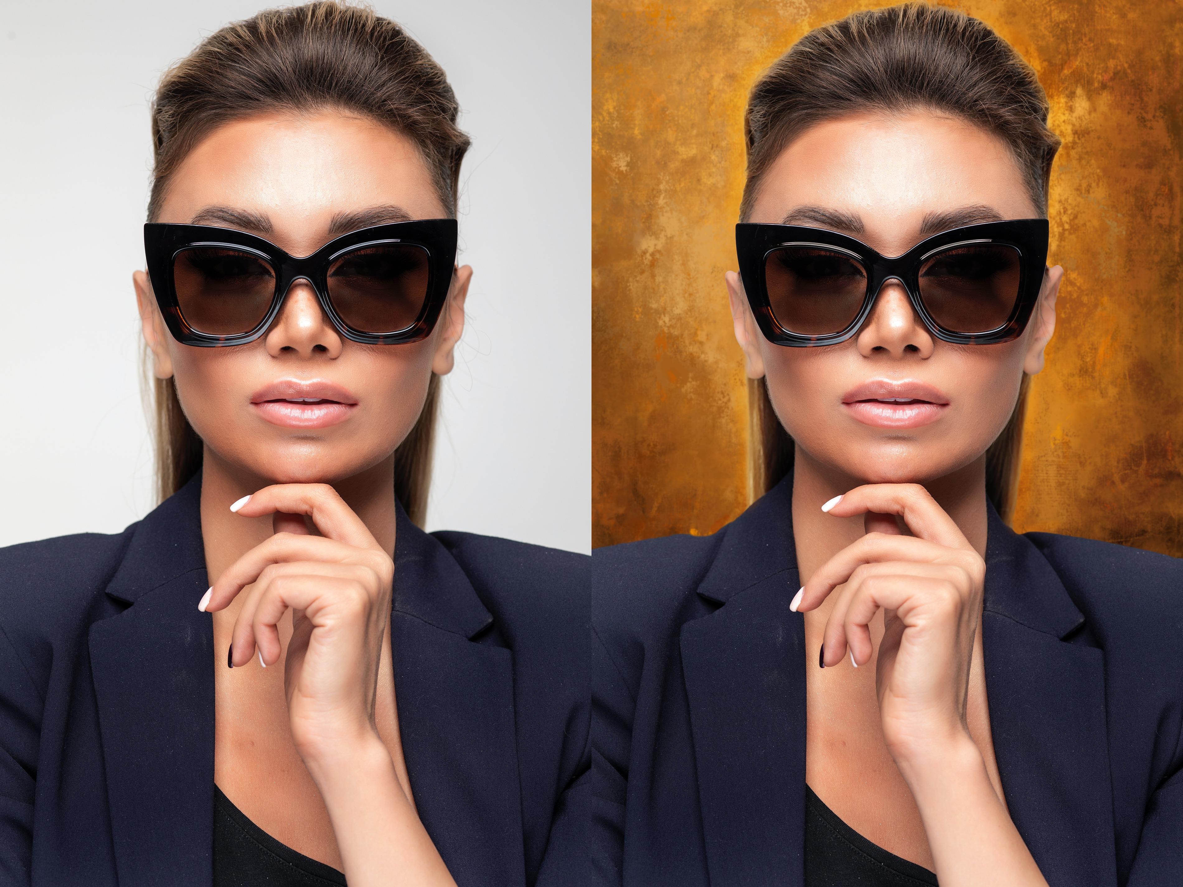
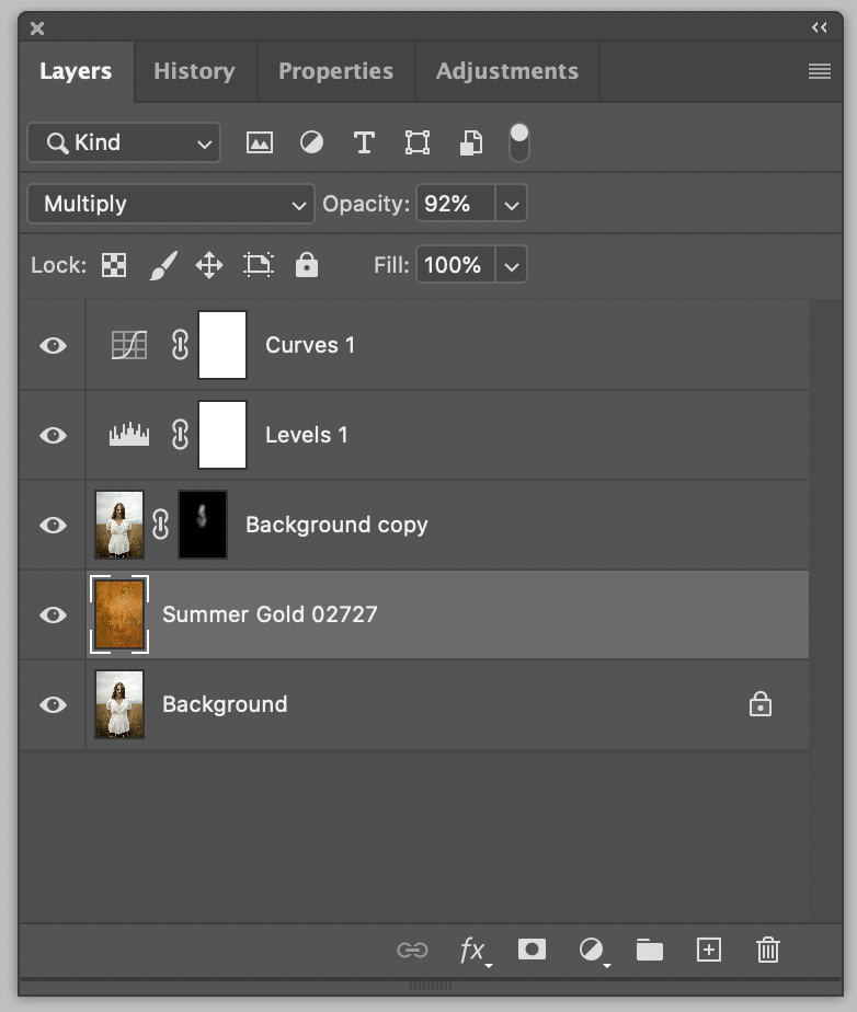
Another easy way to use backgrounds is simply layering them OVER TOP of your subject as a textural overlay. You can layer mask out any areas that are too harsh on the skin, if you'd like, or just keep it super simple and leave it alone. Simply open your retouched file. Find a background you love (or that supports the same lines, values, etc of your subject strengthening your story), and bring over the background to your edit by either copying and pasting or clicking the mover tool in Photoshop (V). Once you've positioned the background layer on top of your edited portrait, start playing with layer modes in the layers palette. This will be on the Background's layer (the literal background layer you just brought in - NOT the portrait edit layer that Photoshop will call "background" if it's flattened and not been renamed). Multiply, Soft light, hard light, and vivid light are often winners. BUT I find these muck up the faces too far. The quick solution here is simply adding a layer mask to the background layer, and lightly masking out with a black brush the areas you don't want to touch your portrait. Boomsies again.
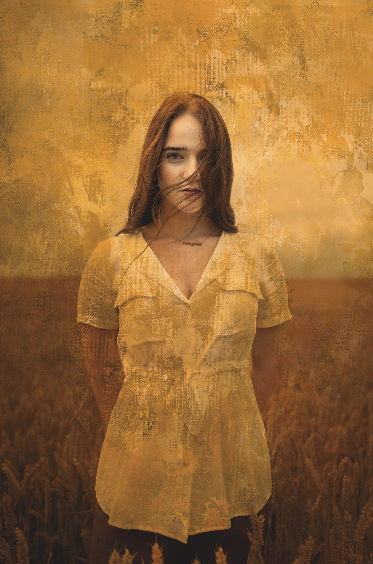
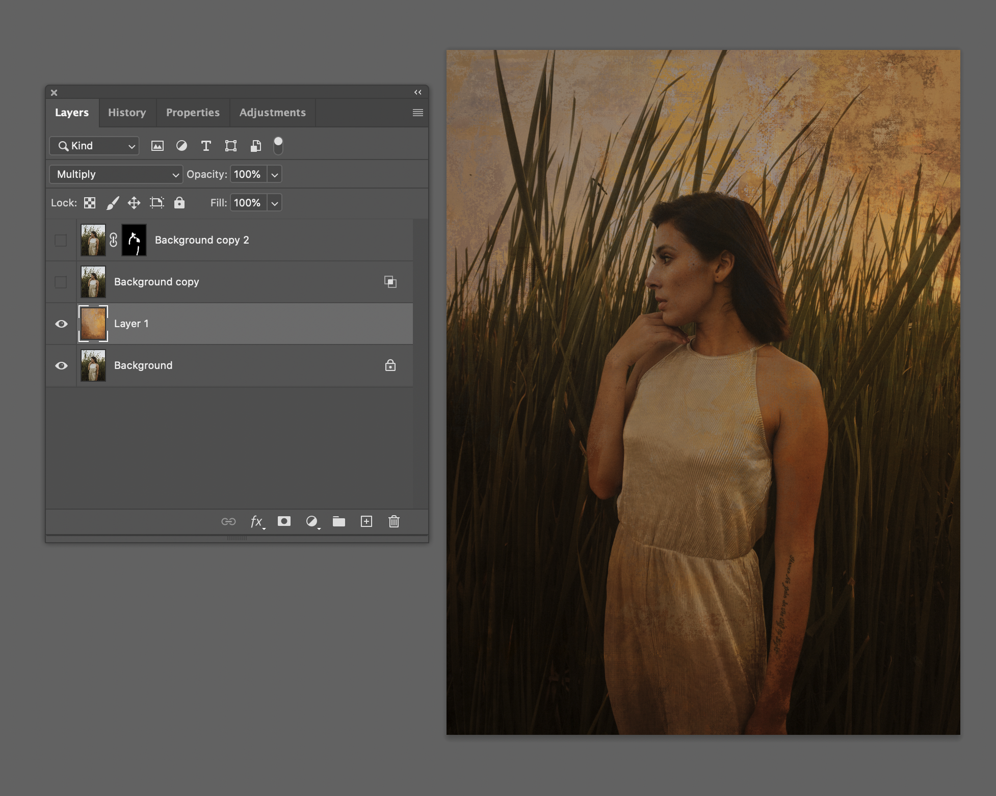
Summer Gold 02727 seen here set to Multiply over the edited portrait with a hint of layer masking over the face. I then tweaked the levels and curves over top just a tad to bring it all together.
MIX IT UP
Once you get the handle of these two editing solutions you can start layering THEM together. I find when the subject is wearing a light, or white, solid material, the possibilities truly open up! And when the lighting is controlled, or there is a strong separation between subject and background it's easier to work with. That's where vivid light really shines. I've found vivid light is fabulous when the subject is wearing a light or white solid fabric as seen here.
 Here the subject was layered over the background set to Vivid Light. Then again layered over in normal and masked out where needed to bring back realism. Summer Gold 02020 seen here.

Here the background was used as a full replacement and then the subject layered back in over Multiply to get the dress as a silhouette. Then another layer of the subject was masked in to bring back the realism in "Normal" mode. This background is from the Foundations Backgrounds Collection # 023.
Here is an example where the background is set to Hard light over the subject, and then a copy of the subject is masked over to return realism in the face. Seen here using Summer Gold 02121.
BLEND IF
I'll admit I'm new to this feature, even though I've been in Photoshop for over 20 years. I've recently started using this to create fractured abstract prep files to take into Corel Painter as my Painter "clone" sources. So I'm not going to try to educate you on this process, because I honestly don't understand the nuances. I just know it provides brilliant results when using Background textures in a semi abstract interpretation. Here is a video that's helpful to get started. https://www.youtube.com/watch?v=DZ9oEwhAfKY
Example below seen using Summer Gold 0505.
Starting from the lower layers, I left the Background alone (my edited portrait). Layer the background of choice (Summer Gold #0505) over top in Multiply mode. This is too contrasty over the subject. 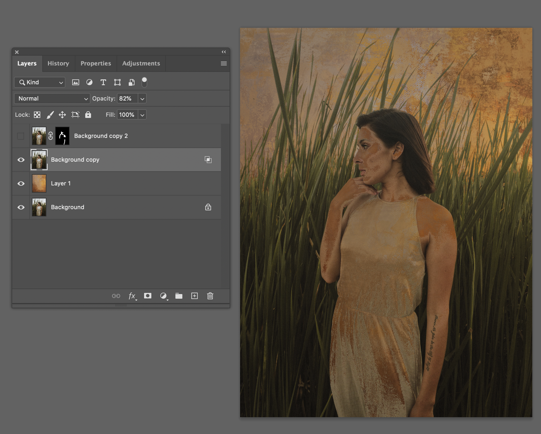 I made a copy of the edited subject and used the BLEND IF method. Double click the layer and "Layer Style" dialogue pops up. I simply adjusted the bottom black and white sliders until I got something I liked.

(Above) You can see the final layers with a copy of the portrait in the top layer masked out to simply bring back the skin I wanted to lay over top of everything in normal mode.
Here's another example using the Blend If method. It just works well with the textures even outdoors. 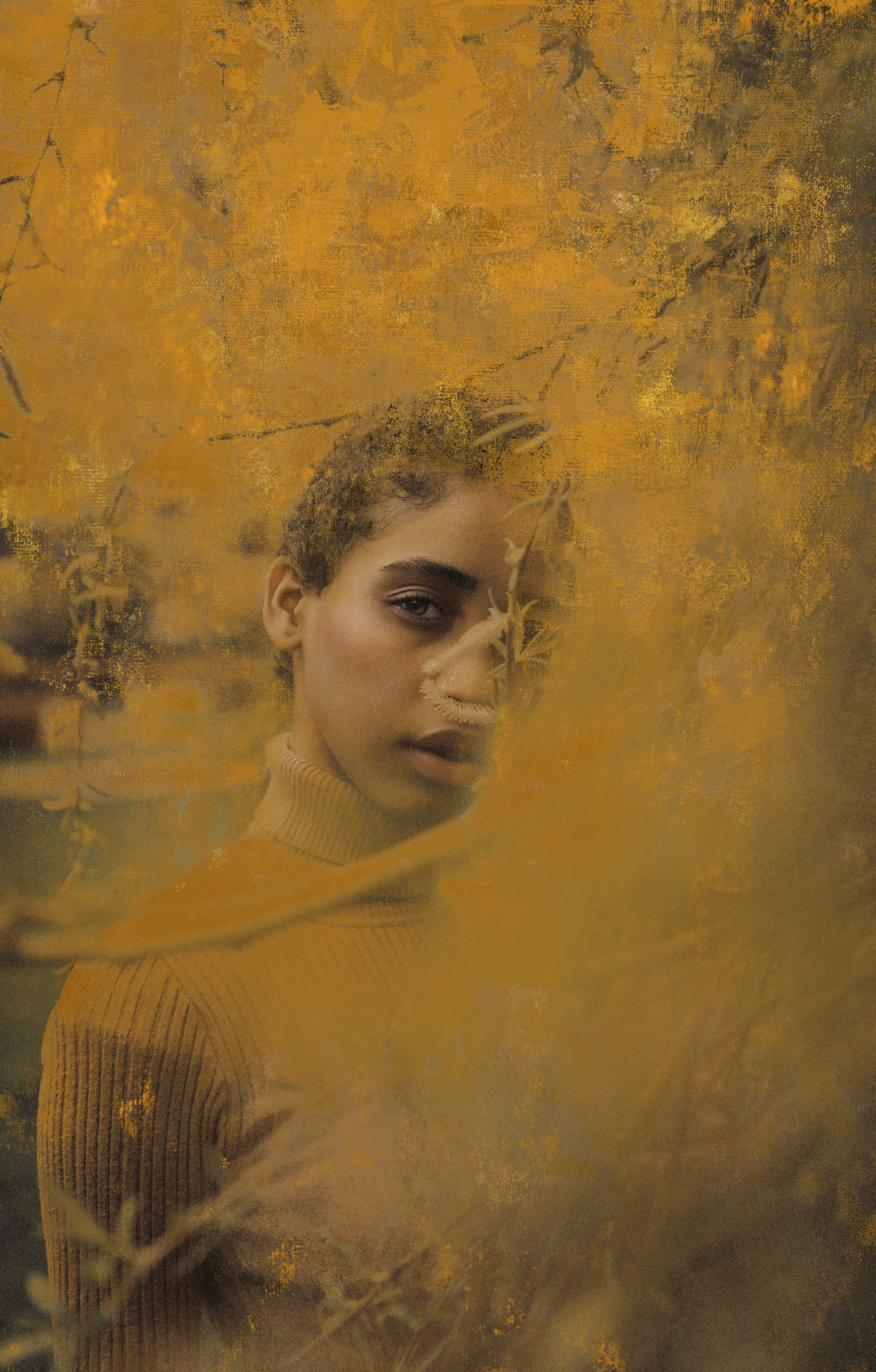
TEXTURES in brush and layer palettes
If you build brushes, or work with Corel Painter 2020 (or newer) there is a ground breaking palette called the Texture palette where you can manually import seemless, full bleed textures of your choice into the program. Think of this as a custom prepared board or canvas that you've gessoed and texturized before painting. The key is using constrasty, monochromatic jpegs. I cover this in detail in the Brayers and Wax tutorial. The backgrounds may be used as textures. Simply desaturate them, and give them insanely high contrast. Then import them into Corel Painter (remember, only 2020 and newer has this feature) into the Texture Palette. Even inverted, they can provide organic effects. I use this every time I'm in Painter. 
Hint: the Alla Prima textures are absolutely BRILLIANT in the "Texture" palettes. Just desaturate them!
I hope this has given you some insight how to get started with the backgrounds!
Have fun and happy creating!
Stay connected with news and updates!
Join our mailing list to receive the latest news and updates from our team.
Don't worry, your information will not be shared.