
The Challenge of Growing Pains
I’ve watched IPC since I was ten years old.
It’s been 27 years of IPC in some shape or form. I haven’t entered all of those years, but I was close by with family members entering since I was ten. The “artist” category has grown from the days of manually retouching prints (or negative retouching!) with dyes, paints, and pencils and presenting layouts with actual paper (gasp, remember those days?)! Now it’s evolved to heavily Photoshop or Corel Painter reliant artistry ranging from elaborate composite work to fully hand painted imagery. There are the rare events that true oils, with nothing digital are submitted (hello, Linda Weaver, you talented beast!). There has been a huge shift in the artist category in the last 27 years indeed. I’ve watched, I’ve entered, heck, I even became a juror. And with that amount of time, I propose a mental shift, and birth of a subcategory (s) to keep up with the times.
“I think it’s important to remember that making art is a process. It is never finished. The occupation itself is one of process, exploration, and experimentation. It is one of questioning and examining.” — Mel Robson
This is not me writing about what is art and what isn’t. Art is subjective. However, I believe that in order to present fairness in an “Artist” category, I present these two questions:
1) Shouldn’t the jurors judging be continuously be required to submit artwork outside of their own comfort zone (against a baseline of their original work) showing they will recognize and accurately assess techniques?
And 2) Shouldn’t jurors in Artist category be required (and possibly have IPC reimburse or provide?) “continuing” artist education in digital and organic media? In a perfect world the jurors must always be stretching their own limits, and pushing their own boundaries in the current realms of digital and now organic artistry for this one reason: to accurately recognize and assess the difficulty of the technique. They don’t have to have mastered it. They just have to have tried it AT MINIMUM and presented it to the governing body.
If you appoint a person without tastebuds taste a world class chef’s greatest achievement and judge it against something pre-made out of a factory from a box, their judgement is not valid. And to make it worse, it’s going to confuse the audience.
This is about questioning qualification. Not in photography. I highly respect the jurors’ path to qualification as photographers and digital edit-ers. As painters, however, I’m shaking my head, and here is WHY. Because the Artist cases are full of paintings nowadays, I believe they need to now extend their qualifications in digital painting at a minimum. And I am not speaking of composite work and blending pixels. I am talking about a variety of styles finished with an array of brushes. It’s imperative the eyes judging are able to recognize multiple styles (even basic art history “who is Laszlo?”). More and more photographic artists are learning painting techniques, both digitally and organically. The technology has come a long way for digital painters in the last 27 years making it easy for anyone to learn, achieve a sellable art piece, and even master with some grit and determination! In art schools, it’s common for an assignment to be handed out where the student must choose a past artist, and mimic their painting. Don’t force it to conform to your style and pick up tools you’re comfortable with. Study their brushwork, the breaks, the color palette, the lighting pattern, the brush length, and textures used. This exercise was invaluable in expanding and “dating” other styles.

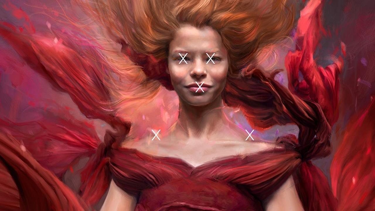
“Phoenix Rising” originally scored an 81, challenged to an 86, and was not accepted into the Loan Collection

This year in the International Photographic Competition (artist) judging, I sat heart crushed as I heard two judges score “Phoenix Rising” in the 70s. One juror was at a 75. Keep in mind an 80, or above is a merit. The comments that kept it out of merit didn’t add up. It made me question the literal vision of the jurors. On this particular piece, I had set up most components myself - the model, the background (I painted myself), and even built new brushes from scratch in Corel Painter 2020 FOR competition so they would be different from my norm, which results in painful stretches of growth.
I challenged myself to paint heavier than my typical smooth, “match-y, match-y” skin that I KNOW judges love. Painting in the chunky, alla prima-esque style is my heart, and I painted my case for myself. Here are the negative comments that were pointed out from a juror who scored it a 75 (Above Average).
1. “but i think they distorted the face the way the lips have come into her chin area even in the guides it has a grey more of a digital dirty look to it and then the upper part in the cheeks are nice and rosy and lighter with highlights on them but it’s dirty from underneath the cheeks down into the neck area- it has the ‘digital dirty look’”

Did you know the face actually has three “zones” regarding color? It has to do with the blood vessels. The forehead is more neutral/yellow. The cheeks/nose are rosy and the jawline tends to go blue/green/grey. It’s science. James Gurney explains this beautifully (if you’re not following his blog, you’re missing out on incredible knowledge and exquisite artistry!). “The central zone of the face has more capillaries carrying oxygenated blood near the surface. The forehead, by contrast, is much more free of muscles and red blood cells. And the chin, especially on a man with a black beard, is bluish from the microscopic hairs. Around the lips are relatively more veins carrying blue deoxygenated blood.” Exceptions can be made BUT it’s a general starting point.
Check out James Gurney’s blog post on the zones here.

2. “and then you come on down and there are such good painting things all through the dress sash and stuff BUT right up under her bottom hand, her hands have not been painted”

Now, I understand the jurors aren’t permitted to zoom in on their monitors but to clarify here is a detail of the hands that I had painted loosely using Sargent and Sorolla as my inspiration.
3. “and so the fabric there has got a definite NOT PAINTED LOOK”

The fabric is exactly as I intended it to be painted. As a phoenix the flames are disintegrating the ends of her fabric. Most of that fabric is painted by hand, free style, from scratch. Difficult stuff.

4. “and then the little fleck of paint on the right arm looks like it’s been cut, rather than the paint that it is. it looks like a gash in her arm.”

The “gash” I believe the juror spoke is painted choice that’s been carried through to tell the story that’s presented in the coloring, the broken edges, and most importantly - the title. This has left me utterly confused, and honestly, livid. The brushwork is carried throughout carefully and intentionally. So with comments like that, I challenge the jurors to expand their art (PAINTING) toolbox and knowledge. Break out of your own personal comfort zone.
By the way, this girl is a competitive swimmer, so her neck and arms really look like that. This phoenix is going to rock the world one day.

The treatment is carried throughout to tell the story intended. This sort of comment only leaves confusion.

Up until the last 10 years or so, digital artistry was fairly limited to composites, retouching, fractal work, and some digital painting. The early trend setters set a precedent within the IPC realm for what was considered excellent digital painting, and it was exceptional (I’m clapping at you, Mrs. Helen, you generous talent!). Does the smooth skin, smooth fabric, and whimsical brushwork ring a bell? And it has been my observation with the many years of watching both behind the screen and as a juror, that jurors who are not painters first rave over this as their “default” high merit in painting - whether it’s been executed well or not. However, that is not the only style in digital painting.
Is this a comfort with a style because of an ignorance in the medium, I wonder?
And I watch year after year of “artist jurors” not recognize exceptionally painted styles score in the exceptional category. Subtle paintings that are brilliantly executed (I’ve seen the large resolution versions before they’re entered) have barely merited EVEN if the other elements have been met. Then what strongly appear to be auto-painted images score in the high 80s, and sometimes 90s! I cringe when I hear jurors expound upon the brilliant brushwork that’s done in what truly look like auto-paintings. If they’re not auto-paintings, they’re not doing themselves favors as the brushwork is mechanical and show all the tell tale signs of a filter. A filter that takes minutes to achieve. The unspoken element in judging Artist’s cases is the degree of difficulty to achieve the final piece from the guide prints presented. This is extremely confusing to the viewers, especially the new entrants. And devastating to the hybrid artist photographers who are actually painting. If a free hand painting of a portrait (that checks all of the 12 elements) doesn’t even merit, whereas later in the day a free hand painting of a flat, abstract concept scores in the high 80s/90s, what message do this leave for the viewer? In a portrait centric photographic association, wouldn’t it make sense for realistic portrait based free handed art pieces to score higher than abstract concepts (ie: cartoon illustrations), when all of the elements are achieved? Or separate them in subcategories (realism vs concept?)?
“Routine kills creative thought.” — Scarlett Thomas
I challenge the jurors and makers to this: get uncomfortable. Growth is about putting yourself into a state of being uncomfortable. Art is subjective. And there is so much of it out there. Instead of breezing by paintings that aren’t within your comfort zone, take a moment and study the brushwork that an artist has rendered. Look closely at their choices in breaks, subtle shifts in colors, maybe “uncomfortable” choices of accent colors (or in my case, broken edges) or story telling. And if it’s not a genre of art you’re comfortable with, look at it in the abstract.
For entry makers, I highly suggest to make yourself uncomfortable. SCRAP YOUR EXISTING DIGITAL HABITS. I see you already reaching for that smooth, round brush. Stop it! Break outside of your “default” style and choose an artist (if you’re painting) that you admire and MIMIC their style. Study it extensively (museums are the best places to do so as you can study the paintings up close and most allow DSLR capture without flash). Look at the color palette, the lighting pattern on the face, the length of the brushwork, the treatment of the blending, how chunky some brushstrokes are. Are the brushes leaving texture? Are they all smoothly blended, or are some purposefully left to create atmosphere and tension? Give yourself personal assignments to mimic that artist.
Here’s the best part: it’s going to force growth. Isn’t that what competition is REALLY about?
And while I’m rambling, MAYBE it’s time to consider adding subcategories in the Artist case in IPC. Consider adding a Freehand category, and a Composite category (I can not tell you how many times I’ve seen my hand painted backgrounds used in entries that made up a large amount of the entry!). Consider splitting Portrait vs Concept under Freehand (or something that would be more illustrative here?)? Expand upon the Artist category as the Portrait Open has grown. Additional subcategory entries must be considered.
I will continue to observe in the background, and encouraging artists to keep painting, keep growing and pushing through the pain.
Keep growing. It’s a choice.
For more information on the International Photographic Competition please visit HERE.
Stay connected with news and updates!
Join our mailing list to receive the latest news and updates from our team.
Don't worry, your information will not be shared.